
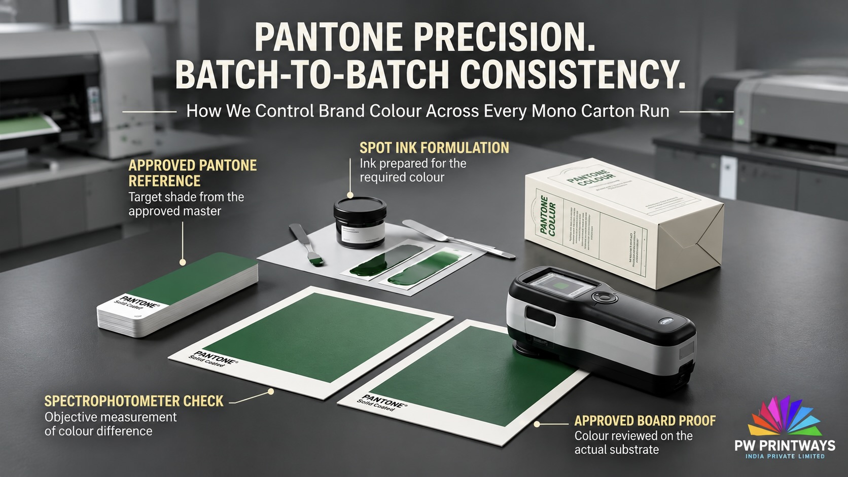
How We Match Pantone Shades Within Agreed Tolerances Across Mono Carton Batches
A brand colour should remain recognisable when a mono carton is reordered months later. Repeatable colour is not achieved by the Pantone number alone. It comes from a defined reference, a consistent paperboard and finish, controlled printing conditions and a clear approval method.
Pantone spot colours · Offset printing · Colour measurement · Repeat-batch control
The short answer
Consistent Pantone matching starts with one agreed colour target—and keeping the production conditions comparable.
For a repeat mono-carton job, the colour reference, Pantone suffix, paperboard grade, print method, ink specification, surface finish and approval conditions should be recorded before production. The press sheet is then evaluated against that approved target, and the finished carton is checked again when coating or lamination can change the appearance.
Where a numerical tolerance is required, the customer and printer should agree the colour-difference formula, measurement condition and acceptance limit in advance. There is no single ΔE value that is automatically appropriate for every Pantone shade, board and finish.
Important distinction
A Pantone code is a reference—not a guarantee that every paperboard will look identical.
Pantone references are shown on defined guide stocks. Your production mono carton may use a different board with its own whiteness, coating, smoothness, absorbency and optical characteristics. The same ink formulation can therefore appear different on different surfaces.
The Pantone suffix also matters: “C” and “U” identify coated and uncoated guide references. They do not mean that a coating or lamination has automatically been applied to your carton. Select the reference that communicates the intended appearance, then evaluate it on the actual production board and finish.
In this guide
01 / Start with the specification
Define Exactly Which Colour the Brand Wants to Protect
Before ink is prepared, the production brief should identify the critical colour and the intended method of reproduction. “Match our brand blue” is not a complete production instruction. A Pantone number, the correct C or U reference, an approved physical sample and the intended paperboard give the production team a much clearer target.
COLOUR IDENTITY
Record the Pantone reference
Write the complete colour code and suffix, identify whether it is a spot ink or a process simulation, and flag which logo, panel or design element is colour-critical.
APPROVAL TARGET
Identify the master sample
Confirm which physical swatch, approved drawdown, proof or signed production carton is the authority for the job.
ACCEPTANCE RULE
Agree the tolerance
Specify the permitted colour difference, comparison formula, measurement condition and visual approval method before the first production run.
Pantone’s Formula Guide provides spot-colour references and ink-mixing formulas for its defined guide stocks. Its guidance also explains that paper surface changes how a colour appears.
See Pantone Formula Guide FAQ →
02 / Substrate control
Keep the Paperboard Consistent Before Comparing the Ink
A Pantone shade can look different when printed on boards with different whiteness, surface coating, smoothness or absorbency. Even when the nominal GSM is the same, a change in paperboard grade or lot can alter the visual result. That is why the approved colour target should be evaluated on the intended production substrate—not only in a guide or on a monitor.
| Board variable | Why it matters to colour | What to keep consistent |
|---|---|---|
| Board grade and lot | Different board constructions or batches can have different optical and surface properties. | Approved grade, supplier specification and lot traceability where available. |
| Whiteness and shade | The board is the background beneath the ink and can influence the perceived hue and brightness. | A comparable board appearance and an agreed substrate sample. |
| Coated or uncoated surface | Surface texture and absorption influence ink behaviour, saturation and printed detail. | The specified surface type and comparable production condition. |
| Caliper and finish | The actual carton construction and finishing route may affect handling, surface reflection and final appearance. | The agreed board thickness and final coating or lamination specification. |
For a deeper explanation of Pantone C and U references and board behaviour, read
How Pantone Colours Behave on Coated vs Uncoated Board →.
03 / Ink and colour system
Choose the Right Route: Pantone Spot Ink, CMYK or a Combination
Pantone spot printing and CMYK process printing are different ways to reproduce colour. A dedicated spot ink can be useful when a specific solid brand shade is critical. CMYK is generally suited to photographs, gradients and complex multi-colour artwork. Some mono-carton designs use both: CMYK for imagery and a separate Pantone ink for the brand colour.
SPOT COLOUR
Dedicated Pantone ink
The spot shade is prepared as a separately specified ink rather than being built from the standard CMYK process separations.
- Useful for critical solid brand colours.
- Requires the correct reference and ink specification.
- Still depends on substrate and press conditions.
PROCESS COLOUR
CMYK separations
Cyan, magenta, yellow and black inks combine through screened printing to reproduce a broad range of artwork colours.
- Practical for photographs and gradients.
- Some Pantone shades cannot be matched exactly in standard CMYK.
- Needs process control and a defined proof target.
COMBINATION
CMYK + Pantone
Use process inks for complex imagery and reserve a dedicated spot ink for the signature brand shade where the job specification calls for it.
- Balances image reproduction and brand-colour control.
- Press configuration and artwork determine feasibility.
- Must be planned at prepress stage.
The correct choice depends on colour importance, artwork complexity, quantity, available press units and the intended appearance. Explore the decision in
CMYK vs Pantone for Packaging →.
04 / Colour approval
Approve the Colour on the Actual Production Board
A digital monitor preview is useful for artwork review, but it is not a physical colour standard for a printed carton. A paper proof may also use a different printing method or paper surface from the final mono carton. When the brand shade is critical, approval should consider a representative sample on the intended board and, where relevant, the intended finish.
Identify the specified Pantone reference and suffix.
Evaluate the spot ink or process result on the intended production board.
Check the colour after the specified coating, varnish or lamination.
Keep a traceable master reference for repeat production.
A proof is a decision tool, not a promise that different substrates, printing processes, finishes and viewing environments will appear identical. The approval method should be written into the job specification.
05 / Printing process control
Keep the Printing Conditions Comparable From One Batch to the Next
Once the colour reference and substrate are agreed, the production team needs to reproduce the intended print condition. Ink formulation and batch, ink film or density, press settings, ink-water balance where applicable, press speed, drying and board behaviour can all influence the result. If the job is repeated, the prior approved production record is a useful starting point—not a reason to ignore changes in material or process.
INK
Use the approved formulation
Record the spot-colour reference, ink formulation or supplier specification and any agreed adjustment made during approval.
PRESS
Monitor the print condition
Check relevant press settings and printed-sheet appearance at make-ready and at agreed intervals during the run.
BOARD
Watch for material changes
Confirm that the production sheet remains aligned with the approved board grade and surface condition.
REPEAT RUN
Compare to the approved job
Use previous approved records to guide setup, then verify the current batch rather than assuming the old result will repeat automatically.
PW Printways production capability
Printing and converting are connected within the published workflow.
PW Printways lists an in-house Heidelberg Six Colour + Coater for multi-colour carton printing with inline coating capability, followed by converting, folding, pasting and inspection. Its published process connects the client brief, artwork, proof approval, printing, finishing and final inspection. The approved colour, board and finish are treated as production references through that workflow.
06 / Measurement and tolerance
What Does “Within Tight Tolerance” Actually Mean?
A tolerance is the agreed amount of colour difference allowed between the approved target and the production sample. It should not be selected by copying a number from another job. The suitable limit depends on the colour, substrate, finish, measurement method and how sensitive the brand is to a visible change.
For measurement-based control, a spectrophotometer can record colour values such as L*, a* and b*. A colour-difference calculation then compares the sample with the agreed reference. The specification should identify the formula—such as CIEDE2000 (ΔE00) or another agreed method—and the measurement condition. Readings taken using different conditions or instruments may not be directly comparable.
| Specification item | What must be agreed | Why it matters |
|---|---|---|
| Reference | Pantone code, C/U suffix and approved physical or digital master as applicable. | Everyone compares against the same target. |
| Colour-difference formula | The agreed formula, for example ΔE00 (CIEDE2000), if instrumental colour difference is specified. | Different formulae can produce different numerical results for the same pair of samples. |
| Measurement condition | Instrument configuration, measurement mode, backing and other required settings. | Comparable measurements require comparable conditions. |
| Acceptance limit | The agreed tolerance for the specific colour and production construction. | Avoids applying an unsuitable universal ΔE number to every job. |
| Visual assessment | Defined viewing light, comparison method and final finished sample. | Instrument data supports—but does not replace—visual judgement of the finished carton. |
Do not assume one tolerance fits all
Agree the number before the job starts.
A highly saturated spot colour on one board may behave differently from a pale tint on another. The printer and brand should agree the target, acceptable difference, measurement approach and visual reference together. This article does not prescribe a universal ±1, ±2 or other ΔE limit for every mono carton.
Technical references:
ISO 13655:2017 – Spectral measurement and colorimetric computation for graphic arts images
and
ISO 3664:2025 – Viewing conditions.
07 / Final appearance
Check the Colour Again After Coating or Lamination
The printed sheet is not always the final colour reference. Gloss coating, matte coating, varnish and film lamination can change reflection, surface gloss, perceived saturation and visual depth. A colour that looks acceptable before finishing may look different after the carton receives its final surface treatment.
GLOSS FINISH
Reflection and depth
A glossier surface can change the way light reflects from the carton and influence how saturated or deep a colour appears.
MATTE FINISH
Softened appearance
A matte surface diffuses reflection differently and can make the same printed colour look less glossy or visually softer.
LAMINATION
A new surface layer
Film and adhesive add another layer to the construction, so the finished carton should be evaluated rather than relying only on the unlaminated sheet.
For more on substrate and finish effects, see
Pantone Colours on Coated vs Uncoated Board
and the related article on
CMYK vs Pantone for Packaging.
08 / Repeat production
Retain a Colour Standard So the Next Batch Has a Reliable Starting Point
A repeat order should not depend on memory or an old carton pulled from an unknown storage condition. Keep a documented job reference that identifies what was approved and what was actually produced. When a new batch is scheduled, compare it with that reference and confirm that the board, ink, artwork, print and finishing conditions remain comparable.
File name, revision and colour separation details.
Pantone reference, suffix, target and agreed tolerance.
Board grade, shade, surface and supplier details.
Ink specification and the relevant approved production settings.
Coating or lamination details and the approved finished sample.
Approval date, sample identification and any agreed measurement records.
Store retained references away from unnecessary light, heat, moisture and handling. Aged or poorly stored cartons may no longer be a reliable colour master. Pantone also notes that exposure, handling and environmental conditions can affect the appearance of printed guides over time.
09 / Upgrading to mono cartons
Why Pantone Control Matters When Upgrading to Mono Cartons
A mono carton often carries the brand’s most visible colour elements directly on the printed paperboard: the logo, main background, variant coding, product details and premium design features. That makes repeatable colour an important part of the carton specification, alongside board selection, structural design, print quality and finishing.
Variant recognition and repeat runs across multiple SKUs.
Controlled artwork and consistent brand presentation across repeat orders.
Premium brand shades, tonal backgrounds and finish-sensitive colour appearance.
Strong identity colours, clean print and consistent product-family packaging.
PW Printways manufactures custom printed mono cartons and folding cartons from Bawana Industrial Area, Delhi. The mono-carton specification can be developed around product dimensions, artwork, board, printing method and finishing requirements. Explore
PW Printways Mono Cartons →.
10 / Pre-production checklist
What Should a Brand Share for Pantone-Critical Mono Carton Printing?
- Final artwork file with the correct revision and linked assets.
- Exact Pantone reference, including the C or U suffix where applicable.
- Identification of the logo, panel or other colour-critical elements.
- Approved physical swatch, printed reference or signed production carton.
- Paperboard grade, grammage, shade and surface specification.
- Spot-colour, CMYK or combined printing requirement.
- Coating, varnish, lamination or other finishing specification.
- Agreed numerical tolerance and measurement formula, if instrumental colour control is required.
- Measurement and viewing conditions for comparing the sample with the target.
- Required quantity by SKU, delivery destination and expected repeat-order schedule.
- Previous batch sample and any known colour concerns or approved adjustments.
PW Printways / Bawana, Delhi
Planning a Repeat-Order Mono Carton With a Critical Brand Colour?
PW Printways India Pvt. Ltd. manufactures custom printed mono cartons, folding cartons and printed corrugated packaging from K-30, Sector-5, DSIIDC Bawana Industrial Area, Delhi – 110039, India. Its published workflow connects the client brief, structure and artwork, proof approval, printing, finishing, die-cutting, folding, pasting, inspection and dispatch.
For a colour-critical enquiry, share the Pantone reference, approved sample, production board, finish, artwork, quantity and previous batch details. The colour target and job requirements can then be reviewed before the next production run.
Discuss Your Mono-Carton Requirement →
PW Printways India Pvt. Ltd. · K-30, Sector-5, DSIIDC Bawana Industrial Area, Delhi – 110039, India · +91 98993 80302 ·
About PW Printways
Frequently Asked Questions
How do printers match Pantone shades on mono cartons?
What does Pantone C or U mean?
Can the same Pantone ink look different on two paperboards?
What is ΔE in colour matching?
Is there one standard ΔE tolerance for every Pantone colour?
Does lamination or coating affect Pantone colour appearance?
Should brands use Pantone or CMYK for mono carton printing?
What should a brand send for a Pantone-critical mono carton quotation?
Technical References
Pantone explains how coated and uncoated guide stocks influence colour appearance and provides Formula Guide information for spot-colour reference and ink formulation. Colour measurement and print viewing references include ISO 13655:2017 and ISO 3664:2025.
Pantone Formula Guide – Technical FAQ
Pantone Graphics Help Centre – Paper Stock
ISO 13655:2017 – Spectral Measurement and Colorimetric Computation
ISO 3664:2025 – Graphic Technology Viewing Conditions
Learn more about
PW Printways India Pvt. Ltd.,
browse
our packaging products
or
contact the team.
