
Colour Transfer Dossier / Pantone / Paperboard / Mono Cartons
How Pantone Colours Behave on Coated vs Uncoated Board
You can specify the correct Pantone number, mix the correct spot ink and still see a different colour on the finished carton.
The substrate is part of the colour.
Quick Answer
Why Does the Same Pantone Colour Look Different?
Coated and uncoated paper surfaces interact with printing ink differently.
On a smoother coated surface, more of the printed ink remains visually concentrated near the surface. On a more porous uncoated stock, the ink interacts more strongly with the fibre and surface texture.
This can influence:
| Colour saturation | Visual brightness |
| Sharpness | Contrast |
| Surface reflection | Perceived colour depth |
Pantone does not remove the influence of paper.
It gives us a controlled language for predicting and communicating colour on different paper conditions.
Critical Terminology
Pantone “C” Does Not Mean an Aqueous Coating Was Applied
This is an important distinction in packaging.
In the Pantone Graphics System:
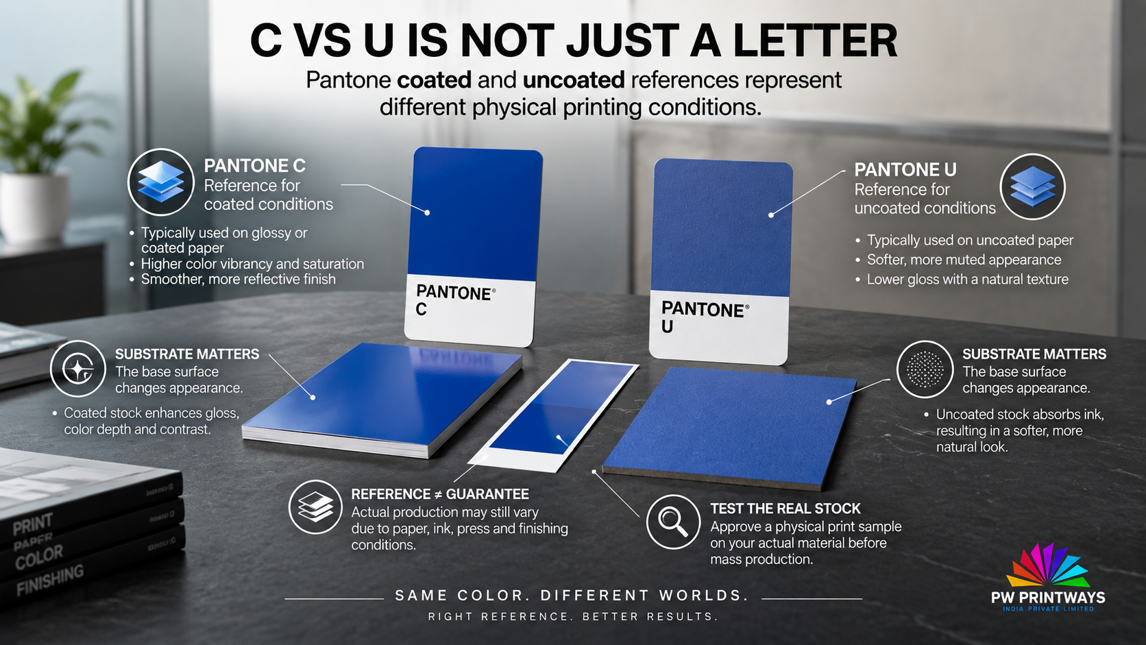
C = the colour reference is shown on coated paper.
U = the colour reference is shown on uncoated paper.
This refers to the printing substrate used for the colour reference.
It is different from applying an aqueous coating, varnish, UV coating or lamination over an already printed carton.
Those are post-print finishing decisions and can influence the colour again after printing.
Reference System 01
What Does Pantone C vs Pantone U Actually Tell You?
Pantone publishes colours on both coated and uncoated stocks because the substrate changes their visual appearance.
| Reference | Paper Condition | Typical Visual Behaviour |
|---|---|---|
| PANTONE ### C | Coated reference stock | Generally cleaner, stronger and more saturated appearance |
| PANTONE ### U | Uncoated reference stock | Generally softer and more affected by fibre and absorption |
The suffix should therefore not be removed from a colour specification.
“Pantone 123” is incomplete communication.
“Pantone 123 C” or “Pantone 123 U” defines a clearer reference condition.
Reference System 02
Your Production Board Is Not the Pantone Book
This is where packaging colour control becomes more technical.
Pantone’s physical guide is printed on specified Pantone reference paper.
Your actual mono carton may use a very different paperboard with a different:
- White point
- Brightness
- Surface smoothness
- Absorbency
- Optical brightener content
- Pigment coating
- Surface gloss
So a Pantone guide should be treated as a colour reference, not as proof that every carton board will reproduce the swatch identically.
Substrate Behaviour
Coated vs Uncoated Board: What Changes Under the Ink?
| Factor | Coated Board | Uncoated Board |
|---|---|---|
| Surface | Generally smoother | Generally more porous / fibrous |
| Ink Absorption | Lower / more controlled at surface | Greater interaction with the fibre structure |
| Colour Saturation | Often visually stronger | Often softer or more muted |
| Fine Detail | Generally sharper reproduction | More influenced by surface texture |
| Paper Colour Influence | Still important | Can be especially visible |
| Typical Brand Character | Clean, precise, vivid | Natural, tactile, softer |
These are general tendencies. Actual colour behaviour depends on the specific paperboard, ink, press conditions and finishing system.
Colour Variable 01
Paper White Is the Colour Under Every Printed Colour
Printing ink is not viewed in isolation.
The paper beneath the ink contributes to the final optical result.
A bright blue-white folding boxboard and a warmer natural board will therefore not provide the same visual starting point.
Printed Colour = Ink + Substrate + Printing Condition + Viewing Condition
This is particularly important with:
- Light pastels
- Skin tones
- Neutral greys
- Luxury beige shades
- Soft cosmetic colours
- Critical corporate brand colours
Colour Variable 02
Optical Brighteners Can Make Colour Evaluation More Complicated
Some white paperboards use optical brightening agents to increase perceived whiteness.
These materials interact with ultraviolet light, so two samples can appear more similar or less similar depending on the illumination used for inspection.
That is why critical colour evaluation should use controlled viewing conditions and an agreed measurement method.
For more on board whiteness and optical ageing, see:
Coating Yellowing on White Folding Boxboard →
Colour Variable 03
Is the Pantone Colour Being Printed as a Spot Ink — or Simulated in CMYK?
This question matters.
A Pantone spot colour and a CMYK approximation are not the same printing method.
| Method | How Colour Is Produced |
|---|---|
| Spot Colour | A dedicated ink is formulated and printed as its own colour. |
| CMYK Simulation | Cyan, magenta, yellow and black dots are combined to approximate the requested colour. |
Some Pantone spot colours cannot be reproduced exactly within a given CMYK printing condition.
Pantone’s Color Bridge guides exist specifically to help compare spot colours with their process-colour approximations on coated and uncoated paper.
For critical brand colours:
Confirm whether the job specification requires an actual Pantone spot ink or permits a CMYK simulation before colour approval begins.
Colour Variable 04
Ink Film Thickness Still Matters
Even when the correct ink has been selected, the amount of ink transferred to the sheet influences the printed result.
Too little ink may produce a weaker colour.
Changing ink density to chase colour visually can also create other production consequences.
This is why a repeatable press condition is important for repeat packaging jobs.
For a broader view of packaging printing technology, read:
The Evolution of Printing Technology →
Colour Variable 05
The Colour Can Change Again After Coating or Lamination
A colour approved immediately after printing may not look identical after the final surface finish is applied.
Finishing can change:
- Surface gloss
- Perceived saturation
- Contrast
- Reflection
- Visual depth
- Appearance under different lighting
That means final colour approval for a premium carton should consider the intended finishing system—not only the ink on the unfinished sheet.
Compare finishing technologies in our
Aqueous Coating vs Lamination Film Guide →
Mono Carton Application
Why Coated Folding Boxboard Is Popular for Colour-Critical Mono Cartons
Many premium folding-carton applications use coated paperboard because its printing surface can support detailed graphics, fine typography and controlled colour reproduction.
That makes it useful for categories where subtle visual differences are noticeable, including:
Cosmetics
Skincare
Wellness
Pharmaceuticals
Premium FMCG
Food packaging
Electronics
Premium retail products
PW Printways’ current product range includes premium custom printed mono cartons for pharmaceuticals, FMCG, cosmetics, electronics, food and retail.
Does That Mean Uncoated Board Produces “Bad” Colour?
No.
Uncoated packaging can be selected deliberately because a softer, natural or more tactile visual character suits the brand.
The issue is not whether uncoated colour is good or bad.
The issue is whether the brand expects a coated-paper Pantone appearance from a substrate that naturally behaves differently.
If the brand intentionally wants a natural kraft or uncoated look, the substrate’s influence may become part of the design rather than a defect.
Brand Specification
The Most Important Question: Which Appearance Is the Brand Actually Approving?
Consider a brand whose official specification is a Pantone coated reference.
The brand then decides to move the carton to an uncoated board.
There are now two different objectives the team might mean:
| Objective A
Accept the natural uncoated appearance represented by the appropriate uncoated colour reference. |
Objective B
Try to reproduce the coated-brand appearance as closely as practical on a different substrate. |
Those are not the same production brief.
Never assume.
The brand owner, designer, printer and packaging converter should agree which physical appearance is the actual colour target.
Why a Monitor Is Not a Final Pantone Approval Tool
A monitor creates colour using emitted RGB light.
A printed carton is viewed through light reflected from ink, coating and paperboard.
The two systems are fundamentally different.
Pantone’s physical coated and uncoated guides exist partly because designers and print buyers need to see colour under real printed conditions rather than relying only on a screen simulation.
Screen Preview
≠
Pantone Physical Reference
≠
Actual Production Board
Pre-Production Control
For Critical Colours, Test the Actual Substrate
The closer the approval condition is to final production, the more useful the approval becomes.
01
Include the C or U suffix.
02
Do not treat the two reproduction methods as interchangeable.
03
Grade, surface and white point matter.
04
The actual substrate is more informative than a generic monitor preview.
05
If coating or lamination changes appearance, approve the complete finished system.
06
Especially important when brightened paperboards or subtle colours are involved.
07
Use it when evaluating repeat runs.
Instrumental Control
Visual Approval Is Useful — Measurement Makes It More Repeatable
For colour-critical packaging, a spectrophotometer can provide objective measurements that supplement visual inspection.
Common colour-control information can include:
| L* | Lightness |
| a* | Red–green colour axis |
| b* | Yellow–blue colour axis |
| ΔE | Numerical colour difference between target and sample |
Where optical brighteners are present, the agreed measurement condition also matters.
There should not be one arbitrary ΔE tolerance applied to every brand and every packaging application.
Better specification:
Define the physical colour target, substrate, measurement method, viewing condition and acceptable tolerance before commercial production.
Repeat Production
Why Can the Same Pantone Colour Shift Between Two Carton Runs?
Even when the artwork has not changed, production variables can.
Paperboard batch — shade, whiteness or surface characteristics may vary.
Ink formulation — colour formulation needs controlled repeatability.
Ink film — changes in applied ink can influence appearance.
Press condition — production settings influence colour reproduction.
Surface finishing — coating or lamination can alter final appearance.
Viewing conditions — different lighting can change visual judgement.
Why This Matters More When a Brand Has Multiple SKUs
Imagine a cosmetic brand using the same signature green across:
- Skincare cartons
- Wellness cartons
- Promotional sleeves
- Natural kraft packs
- Coated premium cartons
The same brand colour may not visually reproduce identically across every substrate without colour-management decisions.
That makes colour consistency a system-level brand decision, not simply a prepress number.
For premium beauty packaging, see our
Cosmetics & Wellness Mono Carton Premiumization Guide →
Production Decision Grid
What Should You Do in Each Situation?
| Situation | Risk | Recommended Action |
|---|---|---|
| Brand approved Pantone C; carton uses coated white FBB | Production board still differs from Pantone reference stock | Verify on actual board and agree tolerance |
| Pantone C moved to uncoated board | Colour may become visibly softer / different | Agree whether target is C appearance or U appearance |
| Spot Pantone converted to CMYK | Process gamut may not reproduce spot colour exactly | Review process simulation before approval |
| Colour approved before lamination | Final gloss / colour appearance may shift | Approve finished sample where colour is critical |
| White board contains strong OBAs | Lighting-dependent colour perception | Control viewing and measurement conditions |
Colour Specification Errors
Avoid These Pantone Packaging Mistakes
× Specifying a Pantone number without C or U.
× Expecting the monitor to match the printed carton exactly.
× Assuming every coated board behaves like Pantone’s coated guide stock.
× Expecting Pantone C and U to look identical.
× Approving colour before the final coating or lamination.
× Switching paperboard without reviewing colour.
× Treating a CMYK conversion as identical to a Pantone spot ink.
× Judging critical colours under uncontrolled lighting.
Brand Colour Workflow
A Better Colour-Control Process for Mono Cartons
STEP 01 — Define the colour target
Pantone reference, C/U suffix and whether it is a spot colour or process simulation.
STEP 02 — Lock the paperboard specification
Board family, surface, shade and required printing side.
STEP 03 — Produce representative colour samples
Use the intended substrate where colour is commercially critical.
STEP 04 — Confirm the finishing system
Coating, varnish or lamination may alter the final appearance.
STEP 05 — Agree visual and measurement conditions
Define how approval and repeat production will be evaluated.
STEP 06 — Approve a finished physical standard
Retain it as the production reference.
STEP 07 — Compare repeat runs against the agreed standard
Do not restart the colour conversation from a screen image every time.
Manufacturer Perspective
How PW Printways Approaches Colour on Mono Cartons
At PW Printways India Pvt. Ltd., colour reproduction is considered as part of the complete packaging workflow rather than as an isolated artwork setting.
PW Printways’ published workflow includes structural development, prepress, proofing, printing, finishing and final quality inspection.
The company also lists in-house Heidelberg printing and Bobst finishing equipment supporting controlled production of mono cartons, folding cartons and printed packaging boxes.
For a colour-critical carton, useful information can include:
- Pantone number with C or U suffix
- Approved physical colour reference
- Actual board grade
- Spot or process-print requirement
- Artwork colour coverage
- Coating or lamination specification
- Required colour tolerance where defined
- Commercial quantity
- Previous approved sample where available
The objective is not merely to put the correct Pantone number in the artwork. It is to create a controlled production specification capable of delivering the intended brand colour on the selected carton board.
Explore PW Printways Manufacturing →
Colour-Controlled Printing for Custom Mono Cartons
PW Printways manufactures custom printed mono cartons and folding-paperboard packaging for pharmaceuticals, FMCG, cosmetics, electronics, food and retail applications.
Where colour consistency is important, paperboard, printing, colour target and finishing should be specified together.
Explore PW Printways Packaging Products →
Which Industries Are Most Sensitive to Colour Variation?
Cosmetics & Skincare — restrained layouts and signature brand colours make small differences easier to notice.
FMCG — repeat SKUs and shelf competition make consistency commercially important.
Pharmaceuticals — variant identification and controlled repeat production may make colour consistency important alongside regulatory communication.
Wellness — subtle greens, neutrals and natural colour systems can react strongly to substrate shade.
Premium Retail — minimal artwork can make inconsistencies more visible because there are fewer visual elements to disguise them.
Explore Industries Served by PW Printways →
PAN-India Packaging Manufacturing
Colour-Critical Mono Cartons for Brands Across India
PW Printways India manufactures custom printed packaging from Bawana, Delhi and supports packaging requirements and coordinated delivery for businesses across India.
Pantone and brand-colour requirements can be discussed for businesses across North, West, South, Central, East and North-East India according to the actual paperboard, artwork, printing method, finishing and commercial quantity.
The manufacturing-location signal remains Bawana, Delhi while the commercial packaging focus stays PAN India.
International Requirements
Brand Colour Control for Export-Oriented Carton Requirements
International brands and sourcing teams can discuss custom mono-carton requirements with PW Printways India.
For cross-market colour consistency, the specification should identify the Pantone reference, actual paperboard, printing method, finish, approved physical standard and agreed evaluation conditions.
Colour Specification Sheet
What Should a Brand Send the Printer?
| Pantone Reference | Include C or U suffix |
| Print Method | Spot Pantone or process simulation |
| Board | Approved grade / GSM / surface specification |
| Physical Standard | Pantone guide, approved carton or agreed colour standard |
| Finish | Aqueous coating, varnish, lamination or other requirement |
| Colour Tolerance | Agreed measurement criteria where required |
| Quantity | Commercial production volume |
| Repeat Job? | Provide previous approved production sample where available |
Direct Answer
Does Pantone Look Different on Coated and Uncoated Board?
Yes. Pantone colours can appear significantly different on coated and uncoated paper because the surface affects ink absorption, reflection and the interaction between ink and the substrate. Pantone therefore publishes separate coated (C) and uncoated (U) references. For colour-critical mono cartons, the Pantone reference should be evaluated against the actual production board and final finishing system rather than assuming that the Pantone guide and production substrate will behave identically.
Related Packaging & Printing Insights
PRINTING TECHNOLOGY
The Evolution of Printing Technology →
SURFACE FINISHING
Aqueous Coating vs Lamination Film →
WHITE PAPERBOARD
Coating Yellowing on White Folding Boxboard →
PREMIUM PACKAGING
Cosmetics & Wellness Mono Carton Premiumization →
PRODUCTS
Explore Custom Mono Cartons →
Colour-Critical Packaging
Is Your Pantone Colour Changing When You Change the Board?
Share your Pantone reference, existing carton, board specification, artwork, finish and production quantity with the PW Printways India team to discuss a more controlled mono-carton colour specification.
Frequently Asked Questions
Pantone Colour & Paperboard FAQs
What is the difference between Pantone C and U?
C indicates a Pantone reference printed on coated paper, while U indicates the reference printed on uncoated paper. The paper surface changes how the colour appears, which is why both references exist.
Does the C in Pantone C mean the carton needs coating?
No. The C refers to the coated paper stock used for the Pantone reference. It is different from applying aqueous coating, UV varnish or lamination over the printed carton.
Why does Pantone look brighter on coated board?
Coated surfaces generally absorb ink less deeply and provide a smoother printing surface, which can make colour appear cleaner, sharper and more saturated. The exact result still depends on the specific board and printing conditions.
Why does Pantone look duller on uncoated board?
Uncoated paper is generally more porous, allowing greater interaction between the ink and paper fibres. Its texture and natural paper shade can therefore make colours appear softer or more muted.
Will Pantone C look exactly the same on coated folding boxboard?
Not automatically. Pantone guides use specific reference stocks. Your actual folding boxboard may have a different white point, coating, smoothness, optical brightener content and printing behaviour, so production samples should be evaluated where colour is critical.
Is a Pantone spot colour the same as its CMYK conversion?
No. A spot Pantone colour uses a dedicated ink, while a CMYK simulation builds colour from process inks. Some Pantone colours cannot be reproduced exactly within a particular CMYK printing condition.
Can lamination change Pantone colour appearance?
Yes. Lamination, varnish and other surface finishes can change gloss, reflection and perceived colour depth. Colour-critical packaging should therefore be evaluated in its intended finished condition.
Should Pantone colours be approved from a computer screen?
A screen can be useful for design work, but it should not be treated as the only physical print reference for critical colour because screens use emitted RGB light while printed cartons are viewed through reflected light.
How can packaging colour consistency be measured?
Spectrophotometric measurements such as L*, a*, b* and colour-difference values can supplement visual inspection. The reference, measurement condition and acceptable tolerance should be agreed for the specific packaging project.
Does PW Printways manufacture colour-critical mono cartons in India?
PW Printways India manufactures custom printed mono cartons and folding cartons from its Bawana, Delhi manufacturing location and supports packaging requirements for businesses across India.
Can international brands discuss Pantone colour requirements?
Yes. International and export-oriented requirements can be discussed according to the Pantone reference, paperboard, artwork, printing method, finishing, physical approval standard, quantity and destination requirements.
About PW Printways India Pvt. Ltd.
PW Printways India is a custom printed packaging manufacturer specialising in mono cartons, folding cartons and printed corrugated packaging. Its published workflow covers structural development, prepress, proofing, printing, finishing and final quality inspection.
The company’s in-house Heidelberg printing and Bobst finishing equipment supports controlled commercial production including colour reproduction, cutting, creasing and finishing.
Manufacturing Location:
K-30, Sector-5, DSIIDC Bawana Industrial Area,
Delhi – 110039, India
Market Reach:
PAN India • International / export-oriented enquiries
About
/
Products
/
Industries
/
Contact
